© Angel Barcelona.
All Rights Reserved.
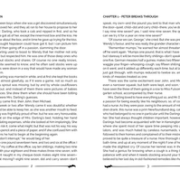
Peter Pan Promotional Package
Objective
The main focus of this project was typography as I was tasked to design a typographic poster, a book specimen and a promotional package of a novel of my choosing. I had to keep in mind that my typography choices should compliment the the novel of my choice.
Programs: Illustrator, Photoshop, and InDesign
Typographic Poster
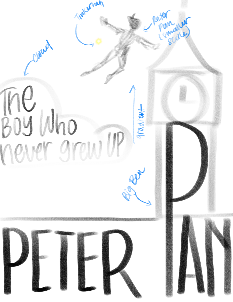
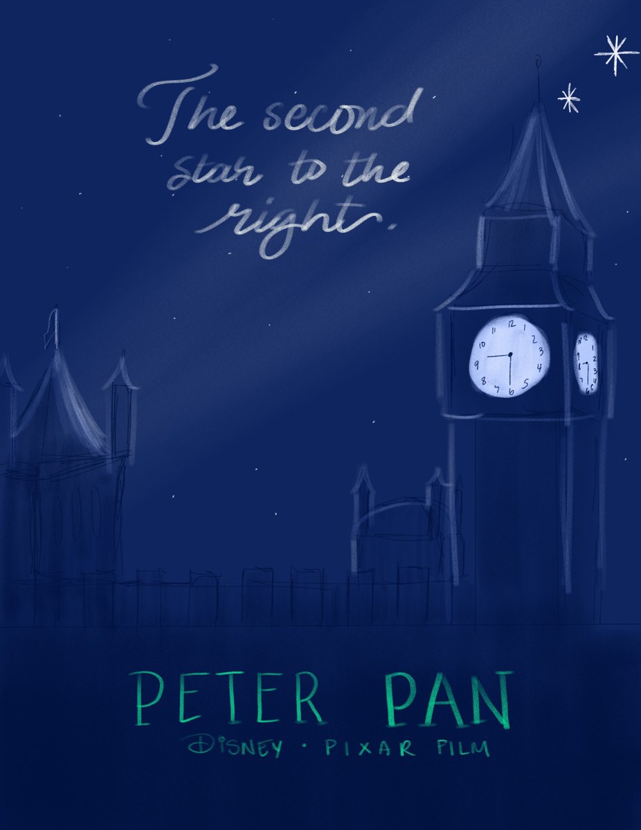
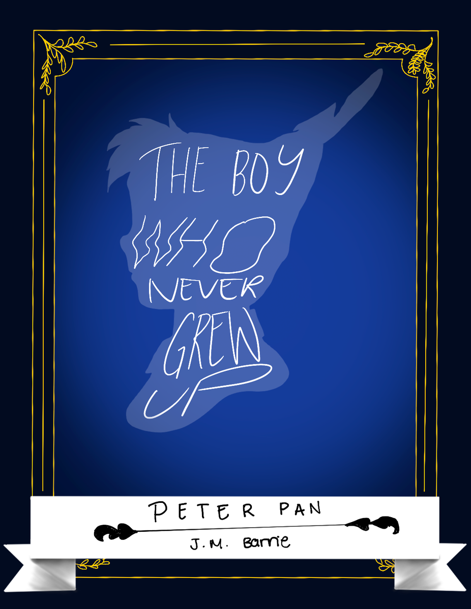
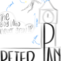
Upon choosing Peter Pan as my novel of choice, I started sketching my typographic poster in procreate. I dug into the different symbols in the novel, from characters to items to quotes. I was looking for the scene I wanted to illustrate in my project. My two main options were:
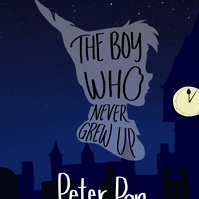
- Peter Pan and the children fly towards to Big Ben, heading to the second star to the right.
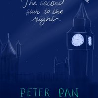
- Big Ben as the main subject of the poster with the clock glowing in the night sky. The building would be silhouettes, covered by the night.
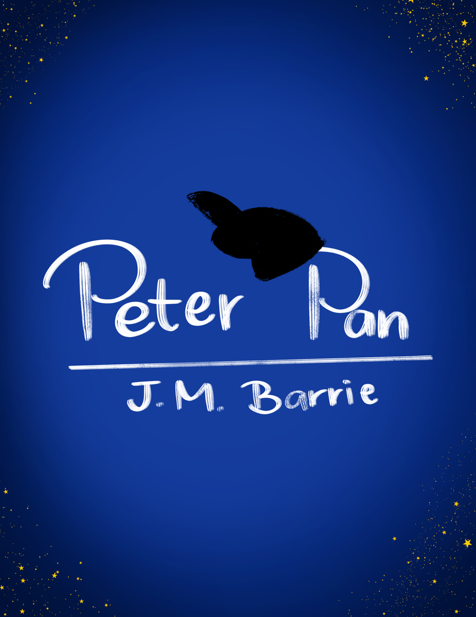
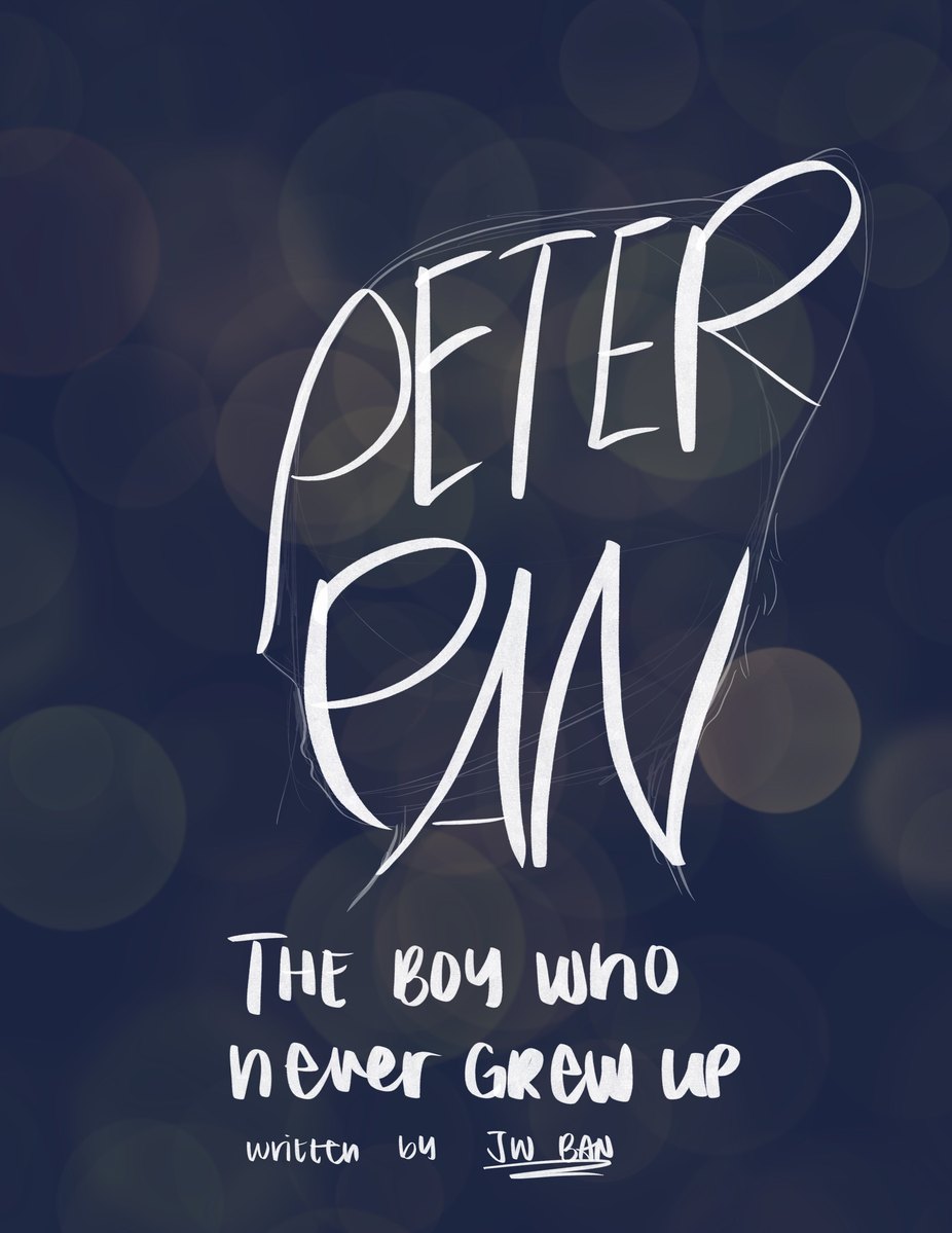
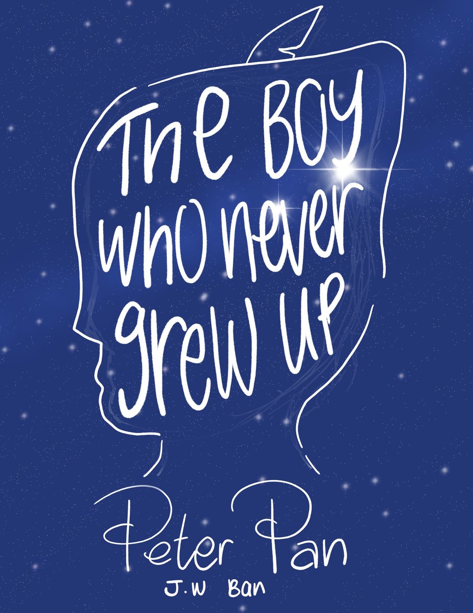
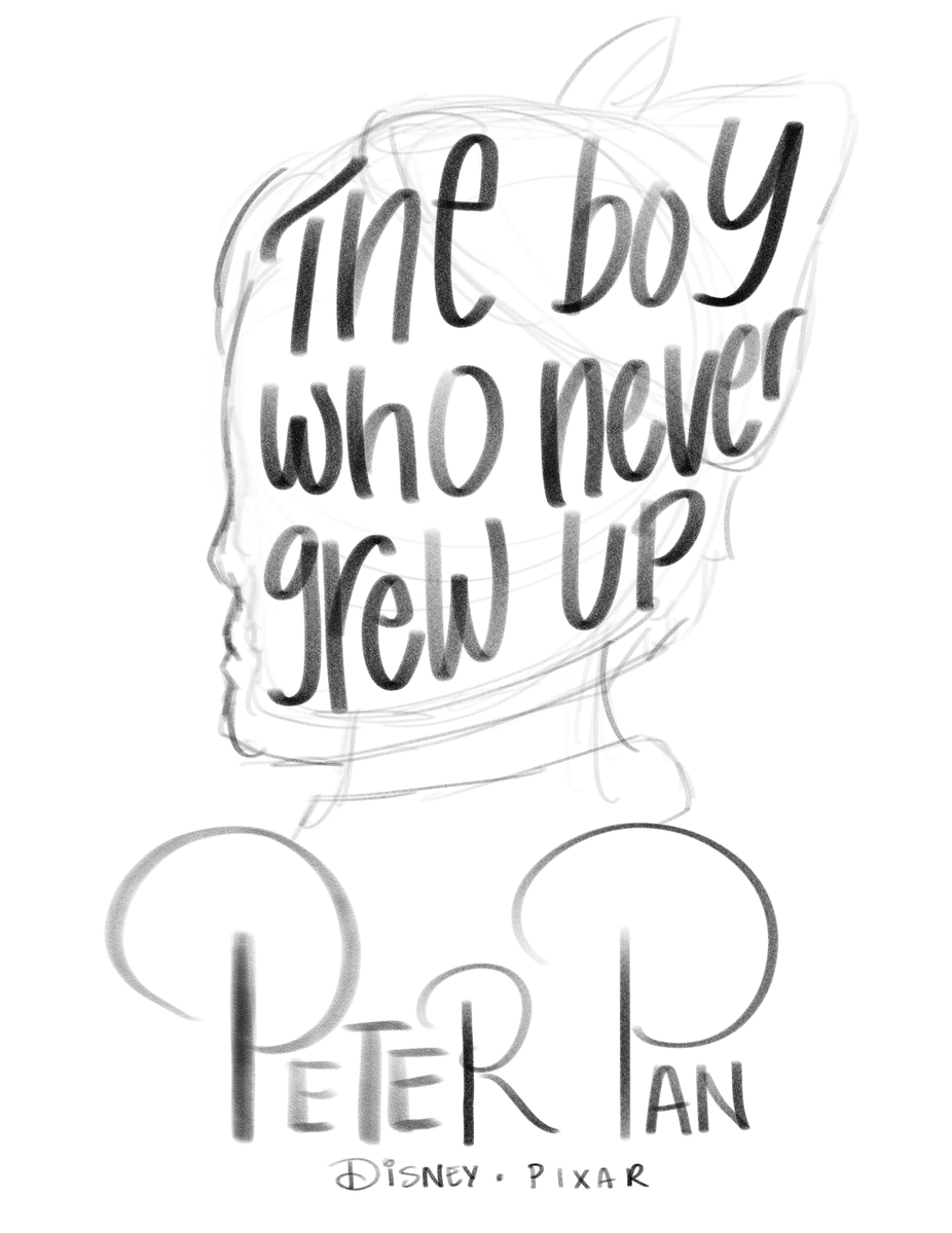
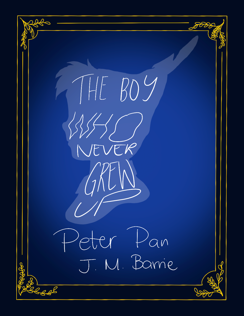
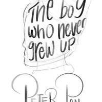
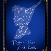
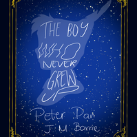
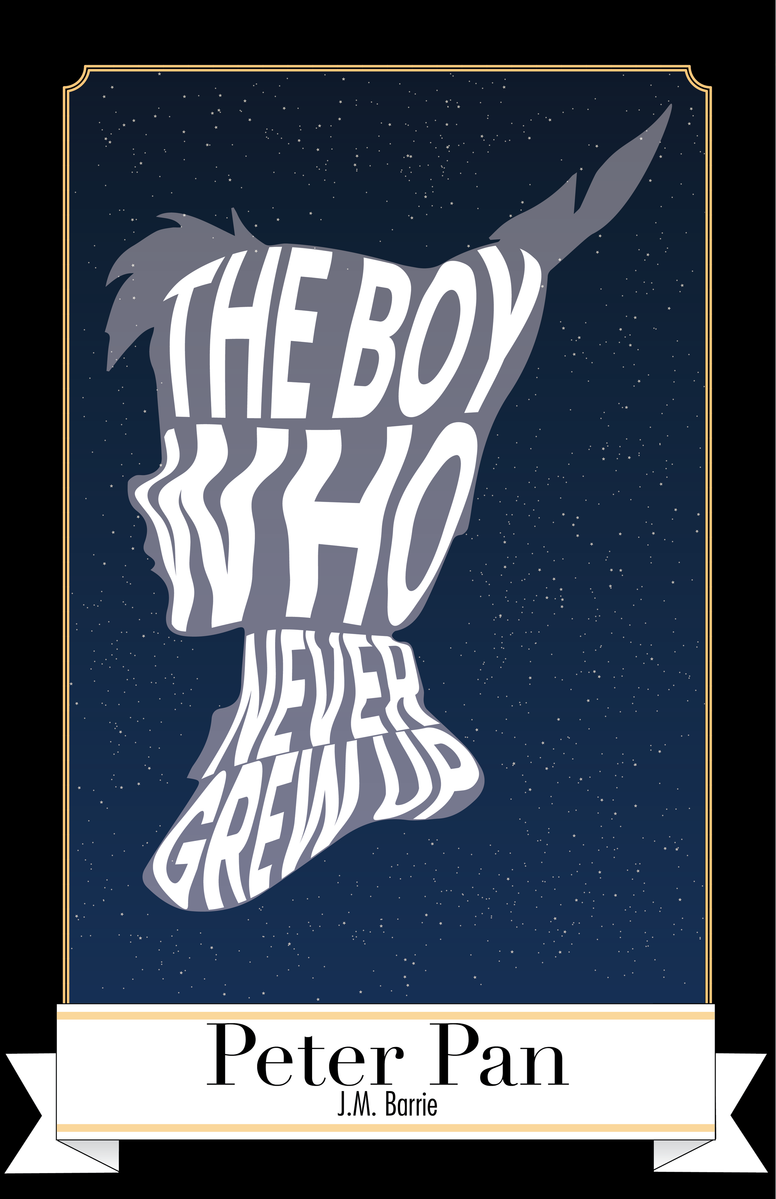
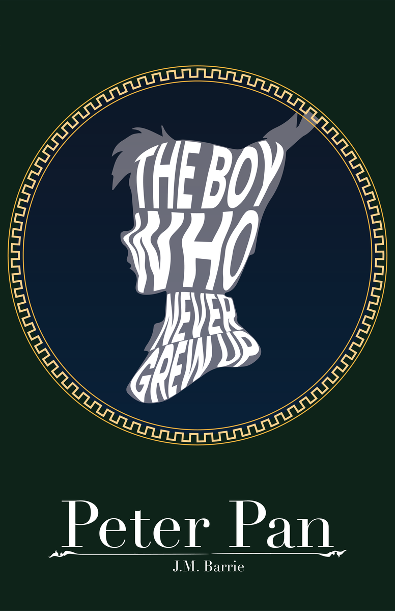
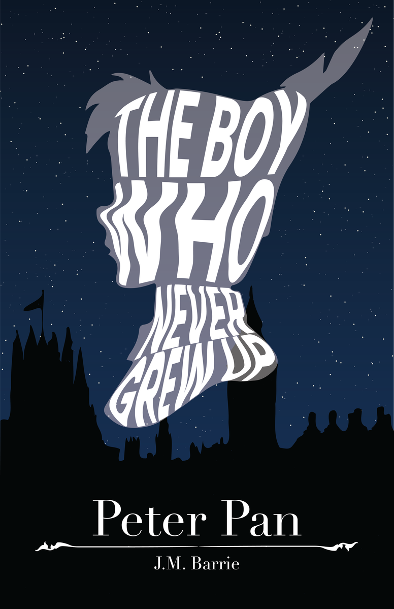
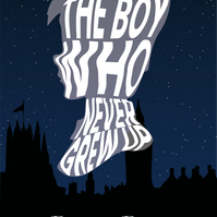
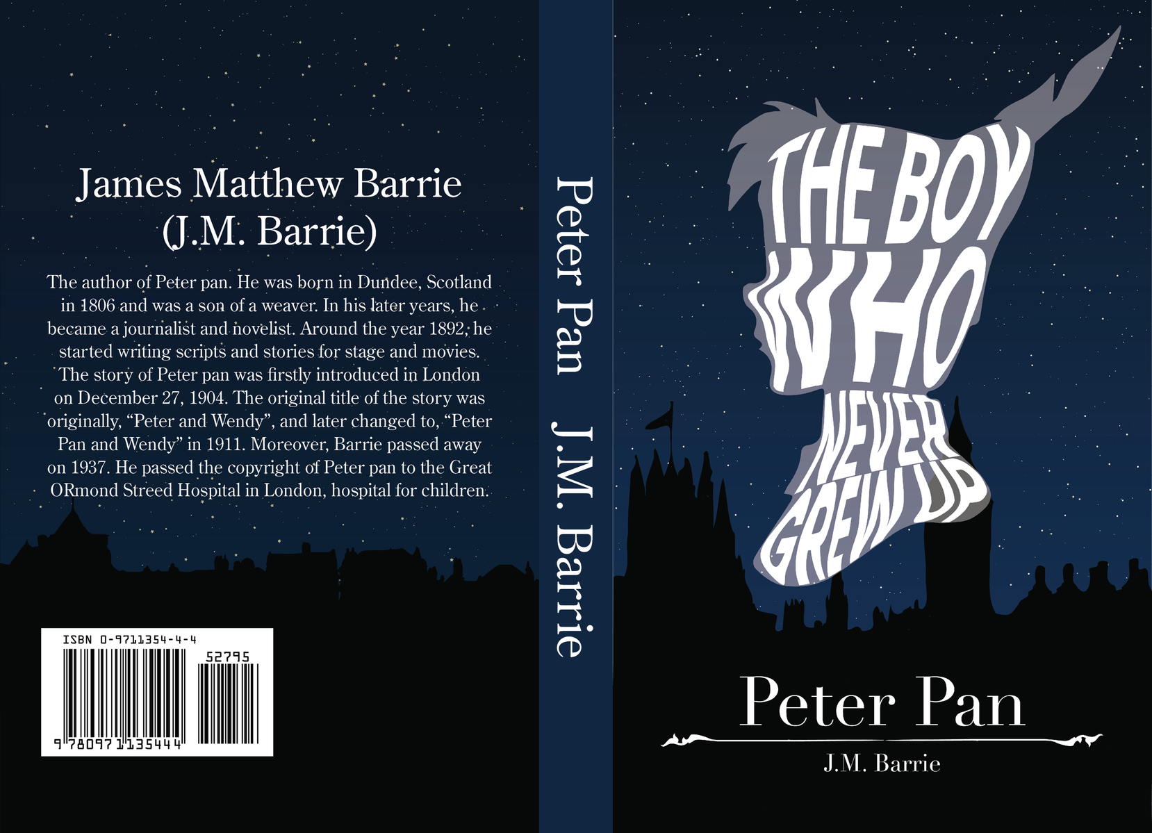
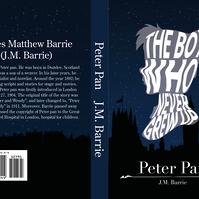
I chose to go with using Peter Pan's head as a silhouette and a quote that's warp, forming in front of the head because it represent what the novel is about, "The boy who never grew up".

Digital Renditions
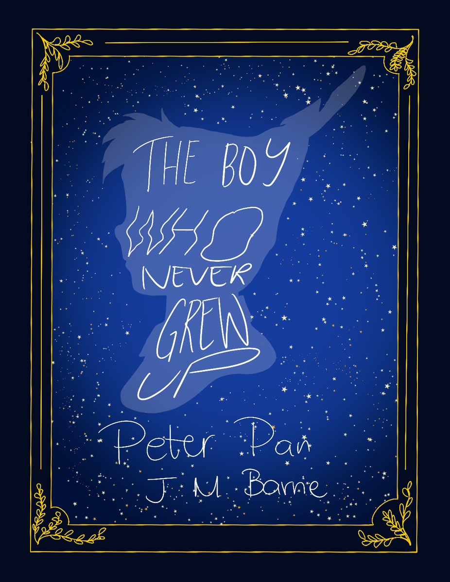
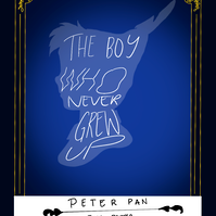
In designing my poster, I had to keep in mind that I was also using this for my book specimen so the poster design has to be versatile. So, in illustrator, I was able to wrap the text around Peter Pan's silhouette. However, I had to break up the silhouette in parts for each line of the quote to wrap properly. And then I realized that sans serif looks better than serif font with the design because the serif was too thin and warping in a weird manner that it was just getting lost in the design. Then I tried using borders and banners to fill the white spaces as Peter Pan's head and the title felt too empty. Once I was satisfied, I settled with the silhouette of London from behind and a starry night sky as it was part of a scene in the story.
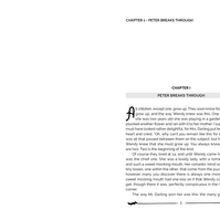
Book Specimen
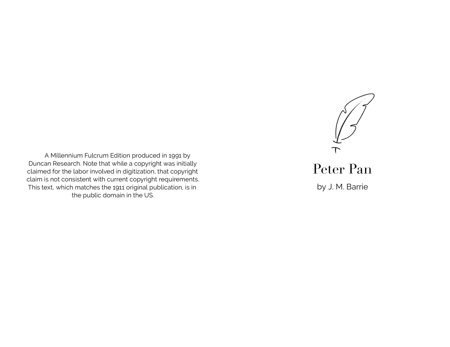
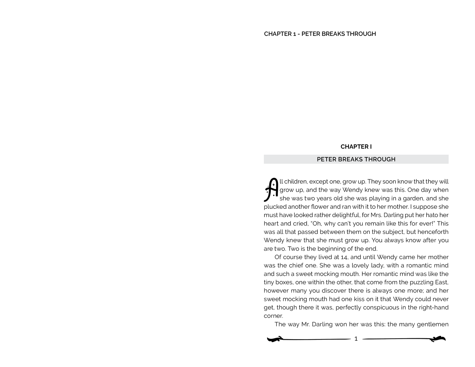
For the book specimen, I made a simple illustration of Peter's feather (the one on his hat) and used it for the title inside the book. I designed the spread with a simple layout because I wanted it to be legible, but still showing the personality of the story. I used a display font with sparkles for the drop cap to add a little flare in each chapter with a simple border at the bottom of each spread.
Mockups


All trademarks and images featured in this portfolio belong to their respective owners. Their inclusion here is for portfolio demonstration purposes only.